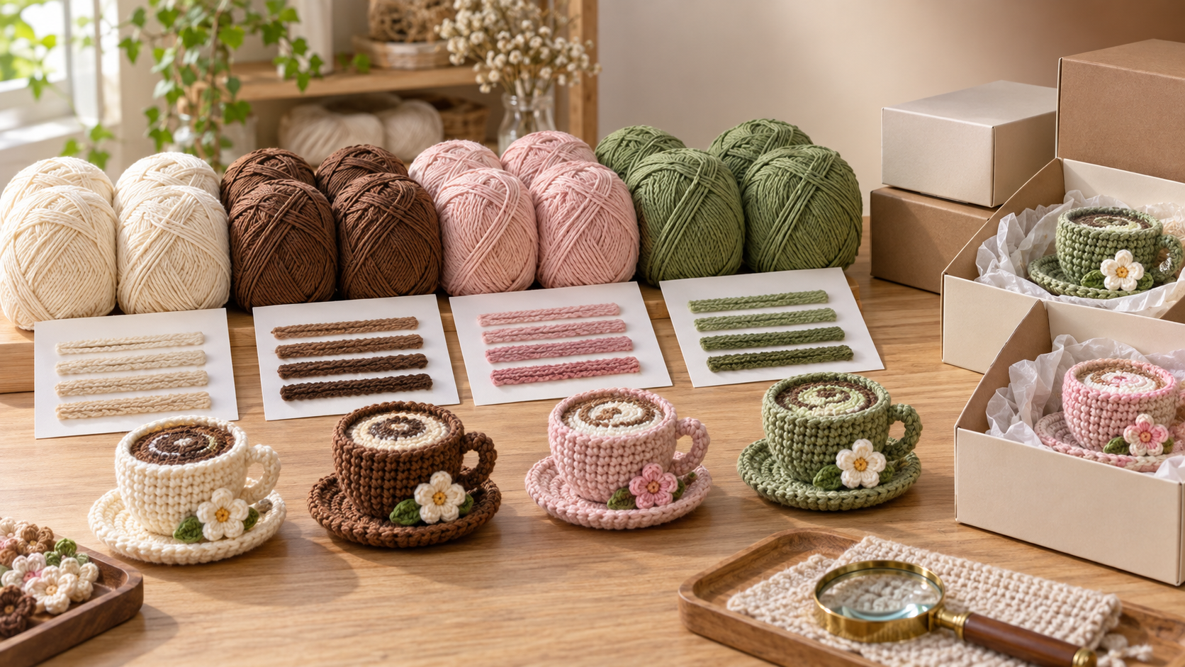
A crochet kit can pass a first-order review and still create a color problem on the next shipment. A cream yarn may lean warmer, a red accent may look slightly duller, or a green leaf component may appear deeper when placed beside leftover stock. In a retail craft kit, these differences are not always visible on a single skein, but they become obvious when kits are displayed together, assembled into the same project, or compared with online product images.
For teams managing quality and safety requirements, the most reliable approach is to control color before bulk production rather than trying to sort mismatched kits afterward. When working with crochet kit wholesalers, color consistency depends on a defined standard, retained approvals, controlled dye-lot communication, and inspection methods that reflect how the finished kit will actually be used. The objective is not to demand that every production lot be visually identical under every light source; it is to establish an acceptable, repeatable standard and prevent unapproved variation from entering packed goods.
Start with a color standard that can be checked later
Descriptions such as “coffee brown,” “cream,” or “soft pink” are useful for product development, but they are too open to interpretation for production control. A written color specification should identify the approved reference and the conditions under which it is assessed. This gives both the buyer and supplier a common point of comparison when a new yarn lot is prepared.
A workable standard can include:
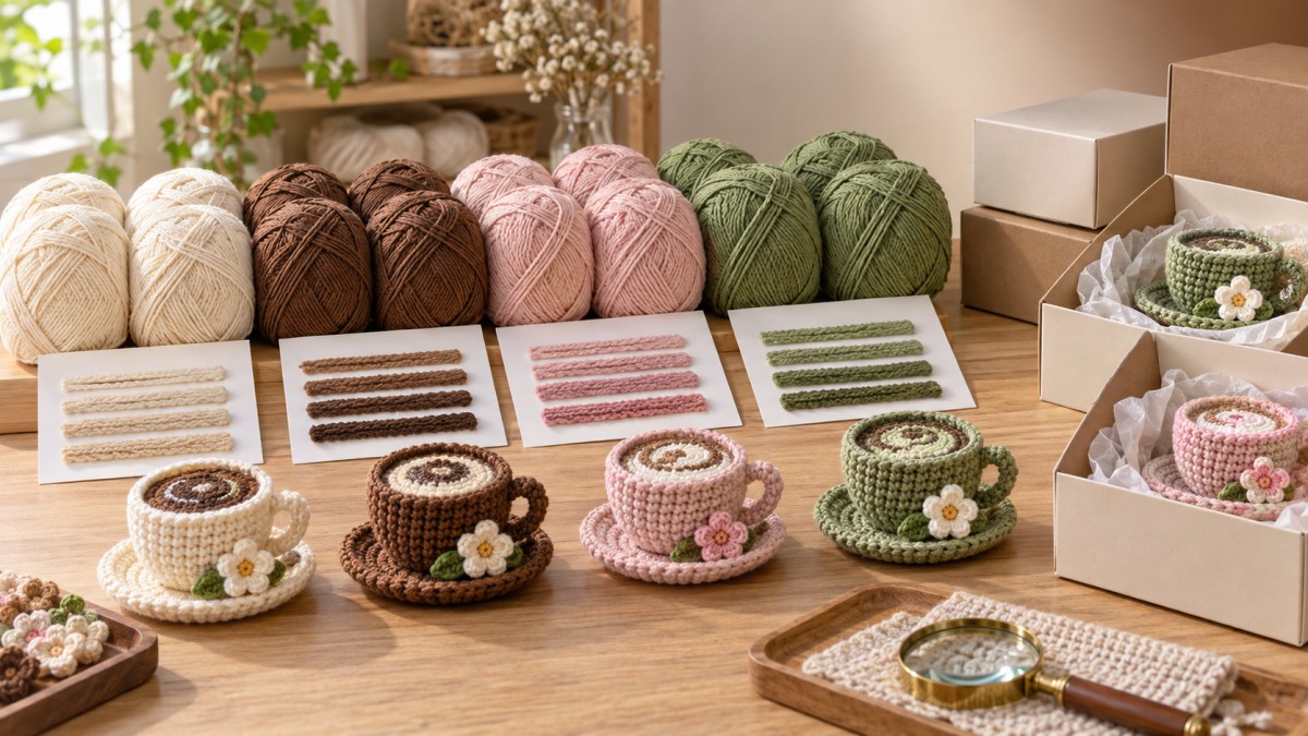
- An approved physical yarn swatch, ideally large enough to show the true yarn structure rather than a loose thread.
- A clearly identified master sample or sealed reference kit.
- Color identification information, such as an internal shade code or agreed color name linked to the approved swatch.
- The fiber content, yarn thickness, twist, and finish, since these affect how color is perceived.
- Lighting conditions for visual review, especially where colors may shift between daylight and warm indoor lighting.
- Acceptance limits for minor variation, with a clear rule for when a lot must be resubmitted for approval.
A color swatch should not be approved in isolation when the kit contains several yarn colors. The relationship between colors matters. For example, a white cup body, brown espresso surface, pink cheeks, and green decorative details may each be acceptable individually but look unbalanced when assembled. Approval should therefore include both individual yarn references and a complete color set arranged as it will appear in the finished craft.
Separate shade variation from material variation
Not every apparent color issue begins in dyeing. Changes in yarn material, fiber blend, yarn count, twist direction, surface fuzziness, or moisture content can alter visual depth. A supplier may use a yarn that appears close in shade but reflects light differently because the construction has changed. The result can be a visible mismatch even where the nominal color code remains the same.
During review, compare the proposed yarn against the approved reference at the same viewing angle and against the same background. Then check whether the yarn is consistent in texture and thickness. A deeper-looking color may be caused by a denser twist; a paler appearance may come from a softer halo or different fiber surface. Treat these as material-control concerns, not merely shade concerns, because a color correction alone may not solve the finished-product difference.
This distinction is particularly important for handmade decorative items. In a product such as an espresso cup plush, the yarn color, stitch tension, stuffing level, and contrast details work together. A darker brown can make the “coffee” area appear larger, while an off-white cup body may reduce the clarity of embroidered facial features or printed message-card styling. The review should consider the assembled item, not only the yarn cone or skein.
Approve dye lots before they are consumed in production
The simplest way to prevent cross-order inconsistency is to make dye-lot approval a release point. Before yarn is issued to assembly, the supplier should provide a representative sample from the intended lot. The sample needs to be traceable to the purchase order, yarn color, lot number, and production batch. If several colors are used, request the complete set at the same time so their interaction can be reviewed.
For ongoing programs, retain an approved cutting or wound yarn card from each accepted lot. Label it with the shipment reference and date of approval. This record helps distinguish a true shift from normal visual memory: a team comparing two orders months apart should not have to rely on photographs or recollection.
Photographs are helpful for communication but should not be the sole approval method. Camera sensors, white balance, screen calibration, compression, and surrounding colors can alter appearance. Use images to flag concerns quickly, then confirm with a physical swatch or finished sample whenever the difference could affect retail presentation.
When a substitute must be considered
Yarn substitutions should be treated as a controlled change, even when the new yarn is described as the same color. Ask for confirmation of fiber composition, thickness, yarn construction, color reference, and intended dye lot. Require a revised pre-production sample if the substituted material affects a prominent area, high-contrast detail, or color-critical component.
For a gift item with a recognizable character design, small changes can alter the emotional appeal of the finished piece. Before approving an alternative, inspect the proposed version as a complete item. The Handmade Crochet Espresso Cup Plush with Pun Card, "I Can't ESPRESSO How Much You Bean To Me" Emotional Support Coffee Plush, Cute Desk Decor Gift for Coffee Lovers, Coworker, Bestie is a useful example of why component relationships matter: the soft high-quality yarn, facial details, cup-and-coffee contrast, and pun card should read as one coherent gift presentation for desk decor, birthdays, Valentine’s Day, graduation, or Mother’s Day.
Make color requirements visible in the order documentation
Color issues often recur because the original approval is not transferred clearly from development to purchasing, production, and final inspection. A purchase order should not simply state “use approved colors.” It should identify the relevant reference sample, revision status, color codes, and any prohibited substitutions. Where the kit is reordered, specify whether the new shipment must match the previous approved shipment or a separate master standard.
Useful instructions include “no mixed dye lots within one retail kit unless approved,” “do not change yarn source without written confirmation,” and “submit bulk-lot swatches before production release.” These statements are more actionable than a general request for color consistency.
Internal packing rules also matter. Mixing multiple accepted lots in one carton may be reasonable when the variation is imperceptible and approved. Mixing them randomly within individual kits can create visible differences between components or complicate complaint investigation. Keep lot identity available through packing records, carton labels, or batch documentation so a concern can be isolated without stopping unrelated stock.
Inspect the finished kit, not only incoming yarn
Incoming yarn checks are necessary, but the final inspection should verify that the approved color plan survived assembly and packing. Yarn can be mixed during production, small accents can be substituted, and color differences can become more apparent after crocheting. Check finished items under controlled lighting and compare them with the sealed reference sample.
Inspection should focus on areas where contrast makes variation easy to see:
- Light and dark yarns joined in the same motif.
- Faces, embroidered features, appliqués, and small decorative pieces.
- Repeated components that should match, such as two handles, ears, flowers, or sleeves.
- Yarn positioned beside printed inserts, gift cards, packaging graphics, or instruction images.
- Multiple kits selected from different cartons or packing batches.
Reviewing several kits side by side is essential. A single item may look acceptable, while a group reveals a gradual drift in shade. This comparison is especially useful when production is spread over time or when one order includes more than one assembly line.
Use a practical response when variation is found
When inspectors identify a possible mismatch, first determine whether it is localized or lot-wide. Check the yarn lot number, assembly date, carton grouping, and which colors are affected. Compare questionable units with the retained approval sample and with units from other cartons. Avoid immediately classifying the issue as a dye failure; the cause may be mixed inventory, a material substitution, lighting differences, or an incorrect reference sample.
If the variation exceeds the agreed appearance standard, stop release of the affected batch until its scope is known. Segregate the product physically and document the visual issue with clear photos alongside the reference sample. Then request the supplier’s lot information and confirmation of yarn usage. A corrective action should address the source of the variation, such as segregating dye lots, revising material issue controls, or requiring lot approval before assembly, rather than simply replacing the units already found.
Color consistency becomes easier to maintain when it is treated as a traceable production attribute. A stable master reference, lot-based approvals, finished-product comparison, and clear change control give quality teams a defensible way to manage repeat orders without turning every minor visual difference into a dispute.
Leave A Message
If you are interested in our products and want to know more details, please leave a message here, we will reply you as soon as we can.

We specialize in supplying home decor, handicrafts, and daily necessities.


